I'm here today with a reminder post for the November CAS Mix Up Challenge! You have until Nov 24th to link up your CAS creations! Bonnie is our hostess this month and she wants us to use
embossing folders in new and different ways.
Who knew there were so many ways to use an embossing folder?
Dry embossing can add wonderful texture to a background or stamped design,
but don't stop there.
Check out some or all of the videos over at CAS Mix Up to find
new and exciting ways to use those folders.
I was again inspired by this embossing folder technique video
for my cards today. The same technique I used on my Nov 1st post. And, again, I made two similar cards as the technique I used
involved sponging over either one or the other insides of the opened
embossing folder.
This time I used a Holly embossing folder from Cuttlebug/Provo Craft along with Golden Acrylic Paints in Cobalt Turquoise and Quinacridone Magenta.
I sponged the two colors of paint on one side of the open embossing folder, spritzed liberally with water and then pressed a panel of watercolor paper over it - pressing down for a minute or two to be sure the paper absorbed the water.
Then I lifted off the panel and washed off the embossing folder.
I repeated the same steps on the other side of the open embossing folder.
So I ended up with a negative print on the left and a positive print on the right!
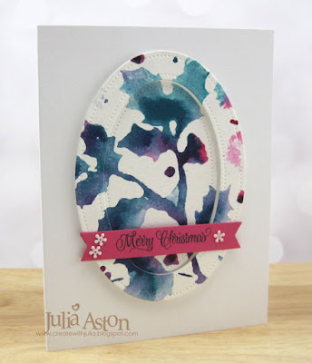
Here's the card I made with the negative print
and here's the card I made using the positive print.
All the same supplies with such a different look by using a different side of the embossing folder!
I die cut the image using Pierced Feature Frames:Oval Dies from PTI, adhering the outside frame with foam dots and adhering the inside piece recessed inside the frame. I die cut the sentiment strip from MFT and stamped it with Merry Christmas from a retired Waltzingmouse Set. I adhered the strip on the edges of the frame and added little white flowers.
Here they are again - side by side.
So, you still have time to get out all of those embossing folders you have and try out some of the new ways to use them!
I envite you to hop on over to the CAS Mix Up Blog to see how all of the talented Design Team and our wonderful Guest Designer Cornelia (Stempel Spass) have used embossing folders in different ways! You have until 11/24 to link up your creation! Remember to keep it CAS!
Stamps: Alpine Christmas - Waltzingmouse (retired)
Paper: Water color - Canson, white and Raspberry Fizz - PTI
Ink: True Black - PTI
Accessories: Golden Acrylic Paint in Cobalt Turquoise and Qunacridone Magenta, water mister, sponges, Holly Embossing Folder - Cuttlebug/Provo Craft, sentiment strip die - MFT, Pierced Feature Frames Ovals - PTI, Vanilla Flowers - Simon Says Stamp, foam dots.


14 comments:
Beautiful cards! I love them both! Thank you for sharing both sides of the folder so we could compare the effect. I never tried anything but "one" side! You are so smart!
That is such a brilliant technique and you have created two stunning cards Julia! Hugs, Anne xx
Que bonitas son las dos.
Colores preciosos.
Felicidades por ello.
Besos y feliz semana!!!
Both are simply gorgeous Julia. I will definitely have to try this. These two colours are perfect compliments and blend so well into each other. The dimensional arrangement truly is unique too. I love this frame and keeping both pieces was brilliant. Can you tell I really really love both? xxx
Julia, I can't wait to try this with acrylic paints, I love the effect you got with the holly EF:)
Fascinating to see the positive and negative images side by side! Wonderful colour combination and great layout!
Such creative and unique effects by using the different sides of the embossing folder and yet using the exact same colours. Love the colours of the acrylic paints and both of your cards are amazing X thank you for sharing this fun tecnique, especially with the paints X
I wish I could sponge and embossing folder and get it to look like this and not splotchy. Maybe I need to try it with paint instead of ink. Both the negative and positive of your cards are beautiful, Julia! Love the color choices!
Beautifully done Julia!! Love the positive and negative prints from the one embossing folder. Beautiful cards with the prints cut into ovals. Especially love the framed oval one with the frame popped up. Both cards are so artsy and creative! xx
OMG Julia, I just LOVE your positive and negative EB folder images using beautiful acrylic paint colors. Your oval inlaid images from your pretty backgrounds turned out beautifully too. TFS both cards and your step by step technique. Hugs..Nancy
So pretty! And I just love it when you get two cards in the same sitting - what could be better?
Both cards are sooo pretty and I love them, Julia! I thought the Guacamole Paint was very beautiful but I love this color combo even better. You got fantastic results of the technique. The way you made the frame is creative and elegantly done.
Hideko xx
This is lovely and I love that color combination.
Gorgeous design elements on your cards Julia I love the negative and positive images.
Post a Comment