Happy Saturday everyone! I didn't get to stamp last night because DH and I went to see a play called Three Tall Women by Edward Albee. Have you seen it?? It's about a woman at the end of life remembering all the parts of her life - and the 3 women in the play each represent a stage - youth, middle age and elderly. It was really interesting!
So - today I was raring to go on the Inspiration Challenge on Split Coast. Today we were to find something in our home that inspired us to make a card.
I chose this tile table above as inspiration. I got it at Michaels on sale last year and use it inside to put plants on and out on my deck in the summer for drinks or food when we are sitting out there.
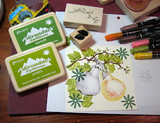
It was fun trying to make this card look just like the tile. I took pictures of each step in the process for you to see how I put this together.


First I stamped my pear on the left on a piece of Very Vanilla Card Stock. I used markers to color right on the stamp so it could be multicolored. Then I stamped it on a piece of paper and cut it out. This cut out is my mask to tape over the stamped pear on the left so when I stamp the second pear it looks like it's behind the first pear. I use Scotts Double sided removable tape to attach the mask so it comes off easily without damaging my stamping.
Then I stamped my second pear (coloring it with markers and not coloring the leaf ) on the right over the mask. I also stamped my branch 3 times connecting the ends a little so it looks like one long branch. I colored in my branch and it's leaves.
Next I moved the mask to cover the second pear and stamped the leaves and flowers. Again - the leaves will look like they are behind the pears. You can move the mask back and forth as you decide where you want to stamp your leaves.

Next I removed the mask and stamped a few leaves over the pears.


11 comments:
This is awesome! I thought this was one of the best challenges they ever gave---I just haven't had time to do one yet! Great job, it matches your tile almost perfectly!
LeAnne
This is a wonderful tutorial and I hope I will be able to try this myself! Your card turned out beautifully! Thanks Julia!
Deena (moonrise)
that is *AMAZING*! absolutely gorgeous!!!
What a great tutorial and marvelous inspired card ... love all of your amazing details.
Wow Julia this is amazing!! It looks better than the table and thank for the step by step! Gorgeous!!
Love all your Homegrown card entries at Varks! Thanks for joining in!
Wow Julia, this is beautiful! If I ever find time these days I am gonna try it!!
Oh my this is stunning!!!
Awesome card....awesome tutorial. Joan
That's amazing how close it looks to the real tile, especially considering you used your own stamps. What a beautiful card.
jessica
Great tutorial and such a wonderful card. It turned out even better than the table!
I was so inspired by your card so I tried to make one of own. I'm a bit ashamed since it's almost a CASE (copy and steal everything) but your card was so beautiful!
/ Inger
Post a Comment