Friday, July 18, 2008

I Felt the Inspiration

These adorable felt baby shoes from Martha Stewart Magazine were Kristina Werner's color challenge inspiration for us today. Aren't they just adorable?! You can see her challenge here.

And this is the card I created. I immediately thought of this cute little baby girl shoe stamp I had.
I used the Swiss Dots Cuttlebug folder for the blue panel and a Martha Stewart lacy punch for the edging. I colored the shoes with my Prismacolor markers and mounted them with foam dimensionals.
I wrapped a piece of the Martha Stewart ribbon around the panel then cut 4 small pieces and tied a knot in the middle of them around the ribbon on the panel. Then I cut the edges at an angle. I added little sticky pearls to the shoes and around the sentiment.
The inside sentiment says "welcome little one".

Thanks so much for stopping by today!
Stamps: Scrap Trends - Classic Baby

Paper: Very vanilla, soft sky, pumpkin pie - SU

Ink: Onyx Black Versafine

Supplies: Prismacolor markes: green tea, burnt ochre, light walnut, cool grey, foam dimensionals, Martha Stewart Ribbon, Martha Stewart lacy punch, cuttle bug, Swiss dots folder, Crystal Sticker Pearls.

Thursday, July 17, 2008

Reflecting on Boston

I needed to make a thankyou/farewell card for a physician that is leaving the hospital where I work next week. I decided to use the sketch challenge over at Split Coast as well as this Zindorf Tutorial for my card.

Here's the sketch we were to use.

I've been wanting to use this skyline stamp from My Favorite Things since I got it - particularly the way Michelle did with the reflection - and it worked perfectly to represent the Boston Harbor Skyline.


The top buildings are clear embossed to protect them when you sponge - but the bottom reflected buildings are not embossed. You use a darker color marker on the top row of buildings and a lighter hue of the color on the reflected part (see the marker colors on my supply list below).


Then you sponge the sky with Soft Sky ink, Not Quite Navy ink and then a little black ink as per the tutorial.


You stamp the mirror image of the buildings using a mirror image stamp by Rubber Stampede - I got mine at Michaels - it's just a rectangular stamp of plain red rubber on wood. You stamp your image on that with black ink - stamp it upside down on your card stock - then stamp the image using the original image stamp just above it right side up - this works best with a clear stamp which this building stamp is - as you can see where you are stamping it above the mirror image. - clear as mud??? Michele's tutorial above shows pictures so don't panic!!

I took a little poetic license with the sentiment and added 'Boston' to cover 'the world' to fit my purposes for this card.


It's no where near as lovely as Michele's - I can't tell you how many attempts are on the floor - but I'm learning!

Stamps: Going Places: My Favorite Things, Snap Stamps: Karen Foster, Mirror Image Stamp: Rubber Stampede Paper: White: PTI, Basic Black: SU, green Bazzill, DP: Arctic Frog - Lilly Pads
Ink: Onyx Black Versafine, Basic Black, Not Quite Navy, Soft Sky: SU
Accessories: Oval punch, nestability petite rectangle, cuttlebug, SU Markers: Almost amythyst, lovely lilac, gable green, green galore, pretty in pink, cameo coral, embossing pen, clear EP, hot gun, sponges, foam dimensionals, photo corner punch, spring moss saddle stitched Ribbon: PTI

Wednesday, July 16, 2008

The First Artful INKables Wednesday Challenge

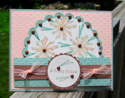
Hi Everyone! I made this card for the first ever Design Team Challenge over on Kristin's Artful Inkables blog. These challenges will be given every other Wednesday and you are invited to join in! See instructions at the end of my post!

This first challenge was a color challenge hosted by Design Team Member Beth. The colors to use are Blush Blossom, Sage Shadow and Close to Cocoa - a wonderfully calming color combo don't you think??!!


On this color challenge I used the newly released Arful INKable stamp set - Sunburst Dandies. I used Julee's MoJo sketch 46 for my design.

I hope you can see how I outlined the blooms with a sparkly Sakura gelly roll pen. It really shimmers IRL! And I added TONS of brads - I think this is the most I have EVER used on a card!

I cut the circles using my Nestability Circles and dry embossed the sentiment one. I stamped the sentiment in Close to Cocoa and the leaves in Sage Shadow - outlining these again with the gliter pen and adding brads.

And now - how can you join in??


1) Just make your card using the challenge colors (or something close if you don't have SU colors)

2) We'd love for you to use Artful INKable stamps but if you don't have any (yet!) use any stamps. And remember Kristin is offering 10% off all her stamp sets for the month of July!

3) Post your card on Split Coast Stampers using the code word ARTINK (all one word in CAPS)

4) If you don't post on Split Coast - just go to Kristin's blog and link your card to the challenge post!
We can't wait to see what you do with these colors!!

Check out what the other Design Team members did for this challenge!


Stamps: Sunburst Dandies - Artful INKables
Paper: Close to Cocoa, Blush Blossom, Sage Shadow: SU, watercolor paper

Ink: Sage Shadow, Close to Cocoa

Supplies: brass brads: Making Memories, foam dimensionals, threaded ribbon: Michaels, Circle Nestabilities, Cuttlebug, Swiss Polka Dot folder, SU Markers: Blush Blossom, Sage Shadow, Gold Gelly Roll Glitter pen: Sakura

Tuesday, July 15, 2008

Coloring the Alphabet

Here is my card for today's color challenge on Split Coast - to use So Saffron, Wild Wasabi and Almost Amethyst on a card as well as for the Double Dare challenge I do with a small group of friends on SCS. Michele (sf9erfan) is today's hostess and her directions were to use the alphabet on your card.
I used my Just Rite Monogram stamper to make a monogramed note card for myself using my 'alphabet' initials! I don't have Almost Amethyst so I used a Bazzill purple that I hope is close to it? I used the polka dots folder with my cuttlebug to emboss the card and my circles are made with Nestability circle dies.

This was so quick and easy and will be a great note card to use for Thank You's etc!

If you'd like to see the other Double Dare Alphabet cards as well as all our challenge cards - check here.

Stamps: Just Rite Monogram Stamper - Curly Font
Paper: Purple Bazzill, So Saffron, Wild Wasabi- SU
Ink: Wild Wasabi - SU
Accessories: Just Rite Monogram Stamper, nestability circles, cuttlebug, polka dots folder, narrow gauze purple ribbon: Michaels, foam dimensionals

Monday, July 14, 2008

Scoring the Moon

Here is my card for the Ways to Use it - Got Grid? challenge over at Split Coast. I used my Scor Pal to make the grid on my white panel scoring on the diagonal every 1/2 inch and I used Michele Zindorf's tutorial for my stamping method. Note: I sponged my ink on as I have not had much success in brayering on color smoothly the way Michele does!

I used 2 floral stamps from the Pressed Petals set from Artful INKables and the sentiment is from the Basic Salutations set. (Both on sale for 10% off during July so check it out!)

After scoring the panel - I masked the moon shape using a 1 3/8 inch punched circle. Then I sponged Soft Sky ink on top and bottom and then Not Quite Navy ink in certain areas as per the tutorial. I removed the mask - stamped the flowers with black Versafine ink - then sponged some Basic Black ink along the left bottom corner.

I added the metal frame and stamped sentiment attaching it with 2 blue brads. I tied black gingham ribbon around the top. To finish it off I layered the panel to a black panel using foam dimensionals - then attached it all to the white card.
I hope you will try scoring a grid on a card - if you don't have a scor pal - some paper cutters (like Fiskars) come with a scoring blade - or you can just use a ruler and your bone folder if it has a fairly pointed end - just don't push it through the paper! I've also scored card stock with a letter opener. Try it out on a scrap first!

Thanks so much for stopping by!
Stamps: Artful Inkables: Pressed Petals & Basic Salutations
Paper: WHite: PTI, Basic Black: SU
Ink: Basic Black, Soft Sky, Not quite navy: SU, Onyx Black Versafine
Accessories: scor pal, black gingham ribbon : SU, 1 3/8 inch circle punch: SU, metal frame: SU, blue brads, foam dimensionals, sponges

Sunday, July 13, 2008

Featured Stamper Birthday and Two New Pairs of Shoes

Today's card was made for the featured stamper challenge over on Split Coast. Stephanie Hargis has some wonderful cards in her gallery and I chose to CASE this one.

I changed the colors and stamps used. I love the simple design of the strip of designer paper, ribbon and angled squares. I used a newly released stamp from Artful INKables called Bloomin Beauties for my image. I colored it it with my Prismacolor markers and cut the squares with my Nestabilities.The card stock is the new Vintage Cream from PTI which I love because it is nice and sturdy. The ribbon is Spring Moss Sadle Stitched by PTI also. Their ribbon is just the best for texture and colors! The designer paper is by Graphics 45 - Times Nouveau Collection - Wallflower - I used both sides of the DP - one side is the herringbone and the other side is the leaves behind my image.
Just a reminder that Kristin over at Artful INKables is offering 10% off all her stamp sets for the month of July - so don't forget to go over there and check out her stamps!
And finally I wanted to share with you two new pairs of shoes I just added to my bulging shoe rack!!! I recently found out that certain Marshalls Stores now have Shoe Megashops and there are 3 near me! So I hopped on over there to check it out and got these 2 great pair of shoes - perfect for me to wear at work in the summertime - or anytime really! Let's face it -what woman needs a reason to buy shoes !!??!! LOL !!!
Thanks so much for stopping by today! I'll be checking out your blogs too!

Stamps: Artful Inkables: Bloomin Beauties & Basic Salutations
Paper: Vintage Cream - PTI, DP- Graphics 45 Times Nouveau : wallflower
Ink: Espresso Adirondack
Accessories: Prismacolor markers: green tea, olive green, Ribbon: Spring Moss Saddle Stitched - PTI, foam dimensionals, nestability squares, corner rounder

Saturday, July 12, 2008

A Yummy Inspired Thank You

Today's Inspiration Challenge on Split Coast was a fun sampling of Cupcake wedding cakes - I chose the blue one here as inspiration.
I immediately thought of PapertreyInk's Out on a Limb set and used that for my branch - I used Adirondack ink for the branch and Color Box Chalk inks for the flowers and buds as they are nice and juicy inks and stamp brightly. I cut the panels with petite rectangles Nestabilities and both panels are mounted on foam dimensionals. I used my cuttlebug to emboss the background with Distressed Stripes and finished up with the ribbon and pierced corners!

Now I'm off to do some errands, water the gardens and maybe sit in the sun a minute!

Stamps: Papertrey Ink: Out on a Limb, Out on a Limb Sentiments
Paper: Creamy caramel, blue bayou, bashful blue: SU
Ink: Espresso - Adirondack, Yellow Ochre & Rouge: Color box chalk inks, onyx black versafine
Accessories: paper piercer, cuttlebug, distressed stripes folder, petite rectangle nestabilities, foam dimensionals, pink grosgrain ribbon : Offray
Techniques: dry embossing