Tuesday, March 15, 2016

Really Big Best Wishes

A friend at work asked me to make a really big 'best wishes' card for someone leaving a committee she is on.  There were a lot of people that needed to sign it so it needed to have a lot of space inside.  So I folded an 8 1/2" x 11" piece of white card stock for the card base - and created this large card!
 Don't you just LOVE the flowers? My card was totally inspired by one my blogging friend, Cathy Webber  made two years ago when she was on the Fusion Card Challenge Design team with me.
The flowers cut using Spring Flowers from Lil'Inker Designs.  I folded them on their stitched lines and layered them with foam dots - the leaves are Tropical Sensations dies from MFT (retired) and the white panels are cut with Stitched Mat Rectangles also from Lil'Inker Designs.
The sentiment is from Gatsby Glamour from PTI.  The floral background is from Black and White Basics from PTI - and I sponged Wendy Vecchi Archival Buttercup Ink over the white flowers to make the paper black and yellow!
The card measures 5 1/2" x 8 1/2" so I had to make an envelope that the card would fit in.  I took a large 9" x 12" white mailing envelope (from Staples) - cut it in half horizontally - sealed the cut bottom edge with a piece of Washi Tape and it was good to go!
The layered flowers really make for an impressive design don't you think?  I need to remember to make more of them for regular size cards too!
Stamps:  Gatsby Glamour - PTI
Paper:  White, True Black, Harvest Gold, Textstyle Black and White Basics - PTI
Ink:  True Black - PTI, Wendy Vecchi Archival Buttercup.
Accessories:  Dies - Tropical Sensations - MFT, Spring Flowers and Stitched Mat Rectangles - Lil' Inker Designs, foam dots, Scotch Quick Dry Adhesive.

Thursday, March 10, 2016

A Weighty Birthday

For the past two years, a friend at work has asked me to make a personalized birthday card for her husband.  Last year I made a card with a bike theme as he is an avid bicyclist - this year when we were trying to think of another theme - she said 'well, he likes to lift weights'.  Hmmm, I thought, how do a create a card with that theme???
But, as sometimes happens -  when I walked into my craft room - I suddenly thought of the strong man stamp in the Big Top Stamps and Framelits set from Alterations/Tim Holtz!
I just LOVE when inspiration hits - don't you???!!!
So I die cut,stamped and colored the strong man - using Archival Jet Black Ink and Ranger Distress Markers in Shabby Shutter, Tea Dye and Black Soot along with my waterbrush.
I also die cut and stamped the stars in the set.    I rummaged through my Paper Stash papers and picked out a piece from Correspondence of a collage of tickets  for the background.   I used two Pocket Cards - one with blue stars and a red label printed on it - and another with a universal calendar - and I highlighted his birthday with green marker - Apr and 2.
I outlined the Small Talk sentiments, stars and Pocket cards with my black Stabilo pencil - then rubbed the lines with a wet finger to smudge to add a little grunge to the design.

She was very happy and excited about my design - and thinks her husband will get a kick out of it when he opens it on April 2nd.

I'm linking my card to the following challenges:
I think I hit the toppings - The Great Divide - my card is divided by 3 panels - the ticket background panel, the stars panel and the calendar panel.

Inkspirational Challenge - Geometric (lots of squares and rectangles in my design)
Our Creative Corner - The Return of the Challenge
I revisited Aug 1st 2013 challenge - Words, Words, Words
Stamps:  Big Top - Stamps and Framelits - Sizzix/Alterations
Paper:  Kraft, Rustic Cream - PTI, DP Paperstash/Correspondence - Idea-ology
Ink:  Wendy Vecchi Dandelion, Archival Jet Black.
Accessories:  Ranger Distress Markers Shabby Shutters, Tea Dye, Black Soot,  Water Brush, Small Talk Occasions, Vial Labels, Pocket Cards, Label Letters - Idea-ology, foam dots, Stabilo Black Pencil.

Sunday, March 6, 2016

Sweet Wishes in a Miniature Coffee Bag

Today I have a little miniature treat bag to share!  I made it for Saturday's Inspiration Challenge over at Splitcoaststampers.  Audrie challenged us to be inspired by a wonderful miniature art web site Paintings for Ants by Lorraine Loots - a South African artist.  For 3 years, Lorraine painted a little miniature work of art everyday.
Lorraine had so many works on her site that to narrow it down,  I decided to go to my birth date - 9/5 and see what she drew on that day.   I found this sweet little cupcake.  I knew this sweet little cupcake stamp from the Coffee Set from WMS would be perfect - even down to the cherry on top (although I covered the cherry with a rhinestone!)-  and I decided to adhere the cupcake to a miniature coffee bag I made using some Kraft Glassine paper and the WMS mini coffee bag die.  It measures just 1 3/8" x 2 3/4" - so all is 'miniature' on my project!
I left one side of the tab closure strip open at the top so you could see how the bag is designed so it actually closes  like a 'real' coffee bag - I glued a piece of wire inside the tab so it would hold the bag closed when folded back. And I put 3 Cadbury Easter eggs next to the bag so you could visualize the tiny size of the bag!
Here's a view with the bag open.  Not sure if you can see - but there is even a little window cut out behind the cupcake and I put a piece of clear acetate there so, if I hadn't filled the space with a cupcake, you would see what was inside the bag 
(if there was anything in it - which there isn't at the moment!)
And here's a view form the side with the top closed. You can't fit TOO much in this little bag - but it will still be SWEET!!!
Unfortunately, this coffee bag die is no longer available - did you hear that Waltzingmouse is closing at the end of March?? So sad.... The versatile Coffee set is still in stock at the moment.

I'm also linking my project to:
This is the first time I've used the coffee bag die
 

Stamps: The Coffee Set - Waltzingmouse

Paper: Kraft Glassine - Idea-ology, White - PTI, clear acetate (from packaging)
Ink: Hibiscus Burst, True Black, Classic Kraft - PTI
Accessories: Dies - Mini Coffee Bag and The Coffee Set (cupcake) - Waltzingmouse, ScorTape, lace from stash, Scotch Quick Dry Adhesive, 24 gauge wire, rhinestones - Kaiser Craft.

Saturday, March 5, 2016

CAS Mix Up

My good friend Loll has started up a fun new monthly challenge with her friend Bonnie - CAS Mix Up.  The first challenge is to use Stamping, Watercoloring and one other medium of your choice.
Here is the card I created,  I stamped the lace and sentiment from Wendy Vecchi's Say It With Art set in Archival Jet Black Ink on a panel of Arches Cold Press 140 lb watercolor paper (thank you Loll for the recommending this!)  Then I brushed some water over the panel.  I have a tray of watercolor paints (solid circles of color like the ones we played with when we were kids) I added some water to a light blue one mixed it with more water in the cover of the paint set and brushed it over the wet panel to get a watercolor wash.
Then I laid my Wendy Vecchi Vintage Quilt Stencil over the panel and sponged over it with WV Archival Sky Blue Ink just on the open spaces.  I adhered the panel to the Vintage Cream card base with foam dots and added Caribbean Blue sequins by Avery Elle.
So very CAS and mixed media at the same time!  
I was so excited by my card that I made 4 more with different colors of paint,  a different stencil (Checkmate) and different sentiments (Crazy Talk/Tim Holtz).
You'll find all the details of the new CAS Mix Up challenges here. I can't wait to see what next month's challenge is!!

Stamps:  Say It With Art - Wendy Vecchi/Stampers Anonymous,  Crazy Talk - Tim Holtz/Stampers Anonymous.
Paper:  Arches Cold Press 140 lb watercolor paper, Vintage Cream - PTI
Ink:  Archival Jet Black, Wendy Vecchi Archival Sky Blue, Pink Peony, Tiger Lily, and Dandelion.
Accessories:  Stencils - Wendy Vecchi Vintage Quilt and Checkmate, foam dots, Sequins - Avery Elle.

Thursday, March 3, 2016

March - A Vintage Journey Challenge - use the DI Travel Bag

For the A Vintage Journey March Challenge (March also happens to be AVJ's Birthday!)  - Nikki is challenging us to use the contents of the March Design Inspiration Travel bag.
Here is Nikki's description:  For our birthday challenge we thought it would be fun to challenge you to use the products in our DI Travel Bag this month.  You’ve seen how the Creative Guides have used the products in the past and you will see how they use them this month too. So join us in using the following  products and enjoy the journey!
  So here are the contents of our travel bag -  the supplies we have to use for our project.
Substrate: Board (eg grey board, coaster board, cardboard)
Main Colour: Lilac or Pale Purple
Technique: Rust Effects (perhaps using rusting or embossing powders or rust coloured paints)
Product: Something Metal
When I looked at the supply list -  the substrate made me think I might make something 3D using  matboard and the color lilac made me think Easter (which is early, the last Sunday in March, this year!) and so here is what I created. I used Eileen Hull's Chair - 3D Adirondack Sizzix Die.
I have several photos to share of just how I put this together - and how I used the contents in our travel bag.
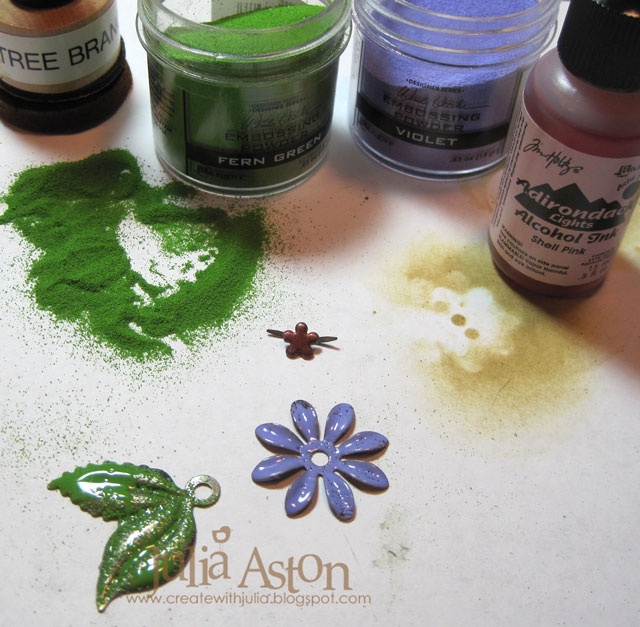
After die cutting all the chair pieces, I inked each one with WV Adirondack Tree Branch Ink
Then I quickly dumped WV Violet Embossing powder over the piece and embossed it with my heat tool.
I did that on the front and back of each piece - then sponged all the edges and bends with Ranger Distress Vintage Photo Ink.  The powder doesn't stick everywhere when you emboss like this which gives it a great distressed/vintage look.  
(you can add more ink and powder as you melt it to get complete coverage if you want that look)
To get the Technique: Rust Effects into my project -  I used Tim's Eroded Metallic Technique found on page 44 of Vol III Compendium of Curiosities for my die cut bunny.  First, I rubbed two Distress Paints over a piece of matboard - Weathered Wood and Cracked Pistachio,  and dried it with my heat tool.
Then I rubbed Tarnished Brass Distress Paint completely covering the panel.  I spritzed it with water, immediately pressed a paper towel over the panel to absorb the water and some of the paint, and quickly removed the towel.  Then I sponged Vintage Photo Distress Ink over the whole panel.
I die cut the bunny (Movers and Shapers Mini Bunny and Bow Set) out of the panel, adding the die cut bow that I had embossed in the same purple as the chair, and a black rhinestone eye.
I added a little tab to the back of the bunny so I could adhere her to the center of the chair.
here she is - sitting up pretty as you please!  
(the glue hadn't dried yet when I took the photo!)
To get the Product: something metal piece into my project - I embossed a flower and leaf stem from Foliage by sponging them with WV Archival Tree Branch Ink and covering them with WV Fern Green and Violet Embossing Powders - again there is an uneven coverage which gives them a nice vintage look (although you can keep adding powder until it is solidly covered with color).  I dropped some Shell Pink Adirondack Ink onto the flower brad that I used to hold the flower and stem together and to attach them to the chair.
I punched a hole in the chair back with my Cropadile to add the flower.
To finish off the decoration of my Easter Adirondack Bunny Chair -  I die cut a row of hearts using the Thinlits Shape Strips out of Kraft Core Cordinations green paper.  I sanded over the paper to reveal some of the kraft core.
I added the strips layered with Small Talk/Occasion stickers across the back of the chair and across the bottom of the chair.  I also adhered 3 of the cut out hearts on the back slats of the chair.
I wasn't sure whether I needed to emboss both sides of each piece when I started making my chair - but I'm glad that I did - as it looks nice and  'finished' no matter what angle you look at it from!
I laid some brown basket filler around the bunny and will also add some candy eggs.
 (I haven't yet because I know I would just eat them, so I'll wait until Easter Sunday!)
So are you ready to create with the supplies in our travel bag??  We can't wait to see what you create with these supplies.  You will find the link to the challenge as well as all of the Creative Guides creations 

We also have a new prize sponsor this month - AVJ is grateful to welcome:
 March Sponsor: Andy Skinner
(check out the AVJ blog to see what  you could win!)
Paper:  Sizzlets Cream Matboard - Sizzix, Kraft Core Coredinations Green Paper.
Ink:  Wendy Vecchi Archival Tree Branch, Ranger Distress Vintage Photo.
Accessories:  Dies:  Chair - 3D Adirondack - Eileen Hull/Sizzix, Movers and Shapers Mini Bunny and Bow Set - Tim Holtz/Alterations, Thinlits Shape Strips - Alterations/Tim Holtz, Idea-ology - Foliage, Small Talk/Occasions, Tiny Twinkles - Taylored Expressions, mini sander - Ranger, Scotch Quick Dry Adhesive, Wendy Vecchi Embossing Powder - Violet and Fern Green, Ranger Distress Paints - Weathered Wood, Cracked Pistachio, Tarnished Brass, flower brad - Making Memories.

March 3rd Fusion - Lucky Days

It's time for another Fusion Challenge -  and we've got a St. Patrick's Day inspiration photo and a wonderful sketch.
  I went with the sketch and star design this time since I don't need any St. Patrick's Day cards this year.
I used a star stencil from MFT with WV Archival inks in Violet, Pink Peony and Tea Rose to get the birthday party feel!  Then I masked the star area and sponged the top with the same Violet Ink.  I added a piece of twill ribbon to separate the two areas. I added a few white sequins and stamped some stars from Star Gazer Additions in black as well as the sentiment from Birthday Cheer.
At the last minute I decided to brush over the die cut sentiment and some of the stars with a white glitter Wink of Stella - you can see the shine on it better in this photo.
So show us what inspires you with this weeks Fusion Challenge!   Link your cards up here.
You will find all of the Design Teams cards there too - they are also linked below.
Julia Aston - me!
Stephanie Severin

and please welcome our first ever guest designer!
Kate Lorenzi

Stamps:  Birthday Cheer, Star Gazer Additions - PTI
Ink: Wendy Vecchi Archival Violet, Pink Peony, Tea Rose,  True Black - PTI
Paper:  White, Melon Berry - PTI
Accessories:  Die - Birthday Cheer - PTI, Melon Berry Twill - PTI, Winter Blend Sequins - Avery Elle, Wink of Stella Glitter White, Scotch Quick Dry Adhesive, ScorTape, Stargaze Stencil - MFT.

Tuesday, March 1, 2016

March 2016 Mixed Media Card Challenge - Trees

It's the 1st of March - and along with the new month comes a new Mixed Media Card Challenge.  Shery has chosen the theme Trees with the optional element of Birds.
I used both elements on my Mixed Media Card this month - using stencils, inks, embossing paste, stamps and a die cut piece of lace!
First I used the WV Checkmate stencil for the background sponging over it with WV Tree Branch and Blue Sky Inks.  Then I used WV Layered Tree stencil and added the tree sponging over the stencil with WV Potting Soil ink.  I mixed a little bit of WV White Embossing Paste with a drop of WV Fern Green re-inker and rubbed it through the leaf part of the Layered Tree Stencil with a palette knife.  The Happy Birthday is from Crazy Talk stamp set and the text is from Ledger Script, both by Tim Holtz/Stampers Anonymous. The stripes at top and bottom were made using WV Dots and Stripes stencil with WV Watering Can Ink.
  I had a strip of die cut lace on my work table  - (cut some time ago to use, but then didn't!) - it's cut using Vintage Lace Die from Tim Holtz and I used Linen Vellum Cardstock - so it's a little see-through - and seemed perfect sitting over the stripes stenciling there at the bottom! (Kent thought it was a fence)
The birds are another stencil - Some Birds from ArtPlorations.  I had meant to stencil them before stenciling the leaves on the tree - but forgot to - so I stenciled  them on either side of the leaves.
So I made a 2nd card with the birds flying behind the tree as I originally intended - a little more realistic perhaps?   I like both versions!  Kent, on the other hand, likes the first one with the birds on either side of the tree because he says he can tell they are birds.
Here's a close up of the birds - flying behind the tree!
So- please join us this month and link up your tree mixed media card over at the Mixed Media Card Challenge!  You'll also find lots of inspiration there from the rest of the talented Design Team!
Stamps:  Ledger Script and Crazy Talk - Tim Holtz/Stampers Anonymous
Paper:  White, Linen Vellum Cardstock - PTI
Ink:  Archival Jet Black,  Wendy Vecchi Archival Ink Watering Can, Sky Blue, Potting Soil, Tree Branch and Fern Green Re-inker.
Accessories:  Vintage Lace Die - Tim Holtz/Alterations, Stencils - Wendy Vecchi Layered Tree and Dots and Stripes, ArtPlorations - Some Birds, Palette knife, foam dots.