Welcome to November and the new challenge over at CAS Stencil! Linda is our host this month and she wants us to use the Stencil Monoprint technique!
So - what is that you ask? Well we just happen to have a technique video linked up over at the Challenge blog - but I'll also show you with photos of how I made my card!
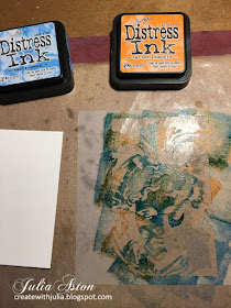
I got out a recently purchased stencil - Stone Face from Stencil Girls. I wanted to do it in blue so I pulled out Salty Ocean Distress Ink - then I chose a color opposite blue on the color wheel, Carved Pumpkin. First I pressed the orange onto the stencil, then the blue.
Then I spritzed with water, you want to spritz liberally, but not so much if runs all over the place or you'll lose the distinct colors.
I flipped the stencil over onto a panel of water color paper and pressed over the stencil with a paper towel to help the watery color absorb into the paper.
I carefully removed the stencil.
and laid a paper towel over the panel, pressing over the paper towel to absorb any pools of water on the card panel.
I dried the panel with my heat tool.
Using this technique, you get a negative print of the stencil, so with the stencil I used, I feel like I have to focus on the image a minute to see the face!
To make it CAS, I trimmed down the panel, cutting it with a Crimped Frame Die from The Greetery and layering it over a teal panel. I stamped the sentiment from Sentiment Suite: Thinking of You onto a banner cut with Sentiment Suite Basics die - both from The Greetery.
I made one exactly the same but with Ranger Distress Fossilized Amber and Spiced Marmalade inks (yellow and orange). The image is more readily seen using these colors for some reason.
(to my eye anyway!)
(to my eye anyway!)
So please join us and try out this Stencil Monoprint techniqe and share it with us over at CAS Stencil! You'll find lots of inspiration from the Design Team as well as our talented guest designer for November, Lucie.
Stamps: Sentiment Suite: Thinking of You - The Greetery
Paper: water color paper - Canson, white, White, Tropical Teal, Bright Buttercup - PTI
Ink: Ranger Distress Salty Ocean, Carved Pumpkin, Fossilized Amber, Spiced Marmalade; True Black - PTI
Accessories: Stone Face Stencil - Stencil Girl, Crimped Frame Die, Sentiment Suite Basics die - The Greetery, craft mat, water mister, paper towels, foam dots.


Wow .....what a stunning effect. Using the stencil in this way sure stretches the stencils and produces such amazing effects. The crimped die cut looks fabulous and the matting layers pick out the colours wonderfully. Thank You for the step by steps and the amazing inspiration x.
ReplyDeleteI really like both these cards Julia - the second one probably shades it for me - only because like you the image popped out at me! x
ReplyDeleteWOW! What an amazing stencil, and great results from the monoprinting. I don't think I can choose a favourite, they both look fab! xx
ReplyDeleteThis mono print is so effective with that stencil, Julia - I did have to look twice but it is fantastic with the mottled colours and also wonderful on the second card - two fabulous cards, hugs Robyn
ReplyDeleteThis is the perfect technique for your stone face stencil, Julia. So cool with the complementary colours! I had to look at it for a few seconds before the face popped out at me. It's so pretty done in shades of yellow and interesting that you can see the image more clearly. Always learning! :) xx
ReplyDeleteLove that stencil Julia and love the colours you chose for the monoprints :)
ReplyDeleteWow..Way Cool stenciled monoprint faces, Julia. I did not see the face until I looked at your 2nd print and saw the face easily. Then looked again at your 1st print and then I saw the face..Cool!! TFS all your photos and your beautiful artsy finished monoprint cards. Hugs..Nancy
ReplyDeleteVery cool stencil monoprint, Julia! I love both color palettes, too...Both cards are really awesome! Barb xx
ReplyDeleteWhat an amazing effect! I saw the blue face straight away, such a great monoprint! Love both colours and your pictorial was fantastic, TFS, Cathy x
ReplyDeleteThey are both gorgeous cards Julia. I did have to focus on the blue one for a moment but once I saw it, I loved the image. The second one is very clear. Such a great technique, beautifully executed! Hugs, Anne xx
ReplyDeleteI think the second image is more noticeable to me too but I didn't have any trouble seeing the image in the first card! Love both color combos! Both cards are so artsy!
ReplyDeleteTwo beautiful results from the stencil monoprint, Julia - wonderful creative cards in lovely colours.
ReplyDeleteI love the monoprint technique and I love it on your CAS cards. I agree that the yellow tricks your eye into seeing the image more clearly. Interesting to see them in the different colors, and so very inspiring! Hugs!
ReplyDeleteFantastic monoprint stone face cards, Julia! I love both versions - complementary colors and monochromatic colors. The crimped frame and the matching color matte are simple and subtle but perfectly give a finished look. Thank you so much for your step-by-step photo tutorial!
ReplyDeleteHideko xx
This is a great card and you are right I didn't see the face when I first looked. I love the 2 colours you chose for the first one. the second card has a different feel as the colours are tonal rather than contrasting but it is just as good just in a slightly different way xx
ReplyDelete